Starbucks Uses China as a Testing Ground for Its New Website: What's Improved, What's Expected
This post comes courtesy of our content partners at TechNode and contributed by Clement Ledormeur, Digital Project Director at digital agency 31Ten, and Vladimir Garnele, UX-UI designer and partner at 31Ten.
Starbucks released its brand new website solely for China on Feb 27, a strong step forward in its “digital flywheel” strategy (Rewards + Payment + Personalization + Ordering). How well does it fare in terms of UX/UI and fulfilling the coffee giant’s aspirations?
Starbucks’ status and positioning as a digital pioneer in the west has been acknowledged consistently for a long time. The digitalization of an already well-serviced loyalty program and willingness to invest in across-the-board innovation have helped Starbucks stay ahead in the game in the US and other countries. According to CEO Kevin Johnson, it also made digital relationships one of their most powerful demand generation levers.

On the other side of the world, breakneck speeds of development and tech adoption in China had the effect of making the chain look digitally antiquated – albeit with incredible brand power. How incredible? Enough to ignore any need for offering the convenience of mobile payments until December 2016 for WeChat and September 2017 for Alipay.
Starbucks in China: From Digital Laggard to an Innovation Lab
Well, it is time to bid farewell to Starbucks’ archaic days in China. The unveiling of the “digital flywheel” strategy in 2016 and the company’s choice to use China as a digital lab is likely influenced by strong regional growth and local consumers’ openness to new concepts. Cutthroat competition between internet behemoths and the centrality of mobile devices in accessing the Internet make for savvy consumers who expect convenience and novelty
It’s no surprise then that it’s China, and not the United States, which makes for an excellent testing ground for emerging digital solutions. Starbucks releasing their upgraded website in China on 27th February ahead of the US is the latest in a succession of initiatives showing the chain’s recognition of the primacy of digital experiences in China:
Tmall store launch
The launch of their e-commerce store on Tmall way back in December 2015 was a positive sign of Starbucks’ responsiveness to China. This is made more significant by the fact that foreign companies continue to respond tepidly to Chinese online retail.
“Say it with Starbucks” WeChat mini program
Starbucks also stood out for its WeChat gift card mini program launched in early 2017, soon after it started accepting WeChat Pay. The unique entry point on WeChat wallet for the 2017 Chinese New Year season truly illustrates the company’s drive to leverage local apps. Early access to the functionality cemented its stronghold on the commercial side of the WeChat ecosystem, with WeChat Pay contributing up to 30 percent of sales the following quarter.

AR-enabled roastery in Shanghai
Though these moves are impactful in their own right, nothing comes close to the frenzy created by the very successful Starbucks Reserve Roastery in Shanghai that opened its doors on Dec 6, 2017. The record-sales-pulling location combines all the underpinnings of a high-end F&B establishment with digital engagement, most notably the Augmented Reality (AR) experiences developed in partnership with Alibaba. The Shanghai roastery may not be the lone one in Starbucks’ portfolio, but it certainly is the most tech-forward of them all.

The New Website: A UX perspective


Intuitive navigation & personalization of the user journey
For the desktop version, the biggest change compared to the previous website is the increase in space dedicated to navigation (one-third of the total screen), with a new emphasis on the most important sections – stores, account, and menu. It also serves as an area for personalized communication. For example, the now-replaced version was composed mostly of static content – something the new website addresses with personalization such as a post-login greeting. Starbucks is gradually but definitely shifting away from their previous online billboard experience to a much more personal, digital one.

Design consistency across the whole website
Consistent design is intuitive design. Starbucks has pulled off the creation of a huge UI Kit (also referred to as a kitchen sink), highly useful in building components with countless possibilities without betraying standardization. Usability and familiarity see improvements when UI elements carry a consistent look and react in similar ways across all channels (app, WeChat mini program etc).

Going all in on mobile
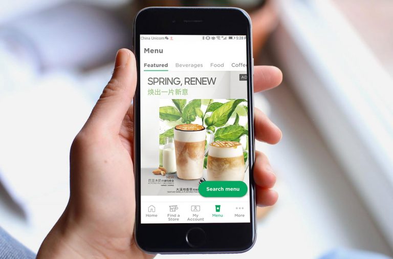
The biggest change in the mobile version is the bottom navigation bar, a standard fixture on popular apps like Tmall, ele.me, and WeChat – a safe bet when adapting for the Chinese market that is often overlooked by foreign brands.

The website introduces a gift icon encouraging users to learn about membership benefits and redeem points. Though Starbucks is no stranger to gamification (a free drink per ten purchases for gold members), the decision to introduce another element is definitely very astute.

Better visibility for call-to-action buttons
The addition of calls-to-action (CTAs) improves interaction and guides user behavior. Though the CTAs are already in use on the US app, they’ve been localized keeping in mind the ubiquity of QR codes in China.

Enhanced focus on three sections: Store, Menu, Account
Completely revamped, these three sections and templates show drastic improvements not only in UI but technical capabilities as well.
Store
Maps are now integrated with geolocation services based on Amap (高德地图, a subsidiary of Alibaba), and the search bar with lunr.js. The page also includes a store legend, categorization (roastery versus standard store, etc.), and directions on how to get to a selected store.

Menu
The menu fans out from the navigation bar, prominently displaying categories or subcategories directly on the left side. On mobile, the menu is part of the bottom navigation bar, a best practice in mobile UX, especially for Chinese users who are accustomed to it.

Account
A personalized home page, inbox, e-invoice requests, updated news are some of the most prominent level-ups.

From purely promotional to educational content
A big part of the new website project (and perhaps a factor contributing to the long development period) was the addition of content all over the website, including FAQs, a help center, menus, an ‘about us’ section, and a blog. This is most certainly a result of Starbucks feeling the pressure from emerging coffee players, and thus looking to move into a position of authority over all things coffee.
The strategy also has the benefit of augmenting acquisition of search and social traffic.

Fantastic performance
The loading times on both desktop and mobile devices are very short, with (minimal) latency observed only for the message displayed on the navigation bar on the left.

This has been made possible by adopting cutting-edge web technology – Node.js with Jekyll and React as frontend framework. The website also loads this fast because it serves pure static HTML.
Conclusion: Gaps and Future Roll-outs
China’s significance to Starbucks’ long-term business plans motivated the company pay due attention to the country’s intensive use of technology and the prevailing conditions that make it such an exciting market for digital expansion and testing. The new website will be heavily tested on the Chinese user base, and takeaways will influence how Starbucks builds its website experiences for other regions. An added bonus (literally) from all this is the direct positive return on digital spend. No other market on Earth collectively responds as enthusiastically to corporate investment in consumer-facing technology, and Starbucks has everything to gain from implementing its flywheel better in China.
Here is what we think should be on the horizon for Starbucks’ plans to further build a fully comprehensive, seamless and omnichannel experience in China:
Providing alternatives to the app
The Starbucks app is the cornerstone of their “digital flywheel strategy,” and remains a mandatory entry point to digital membership. But at ~150 MB download size, it comes at the cost of high user friction, when instead they could direct users to a WeChat mini program, or to a progressive web app like the one developed for western users.
E-commerce
Despite the revamp, Starbucks online purchasing is still only available through their Tmall store. Developing this further (à la Nike and other brands) would give Starbucks more power over its online store and how it chooses to leverage it for cross-platform campaigns. Setting up their own shop would also impart learnings they can utilize in eventually launching a full-fledged delivery service.
More omnichannel integration

Starbucks is still missing out on significant opportunities to meet their customers across all Chinese digital channels. Above (left) is an example of McDonald’s offering WeChat and Alipay login for their WiFi portal, which helps in turning patrons into followers.
Further gamification
Starbucks could have gamified their website and Chinese app further with daily/weekly/monthly member rankings, a feature found on many Chinese apps and social networks.

Delivering on O2O
The Chinese Starbucks app is still behind in terms of O2O services such as pickup – a service that’s been available in western countries for a while now.

China’s strong appetite for delivery calls for a delivery service similar to what McDonald’s or KFC already offer. Currently, several unofficial concierge delivery services fill this gap, delivering coffee orders in all major cities.

Images: TechNode, The Street, Totem Media, 31Ten test from Site24x7 (Shanghai server), Dan Grover


