


Beicology: We Can't Stop Staring at This Mesmerizing Visualization of Air Pollution
Smog. Yuck. That grey, gritty, horizon filling mass of gunk couldn't be uglier, right?
Well, despite our preconceptions about pollution, one Beijing firm has found a way to make those lung blackening plumes look surprisingly beautiful.
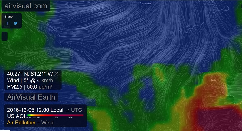
AirVisual, makers of the AirVisual Node AQI monitor, recently launched a new pollution visualization feature called AirVisual Earth. Think of it as a Google Maps for smog, with the same drag and zoom usability. But instead of representing that stifling grey air with Google Maps-esque vivid visual realism, the AirVisual team opted instead to use a gorgeous rainbow spectrum.


Areas that are blue and green represent AQI under 50, while yellow is used for 50-100, orange means 100-150, and red signifies 150-200. Any pollution level higher than that is marked by dark red or, worst of all, purple. The colors are animated, showing the pollution levels in realtime, turning your screen into a kaleidoscope of sorts.

The map's pollution level colors are determined using publicly available meteorological data, plus air quality readings from nodes that AirVisual deployed outside of China (laws prohibit them from doing so on the Mainland). And while the meaning behind those vivid images are troubling, at least when they turn red and purple, they do have a somewhat soothing effect, and make for a better alternative to looking at the ashen horizon out your window on a hazy day. However, that likely wasn't the intention, and we also readily admit that the pretty map has the more pragmatic effect of helping users immediately see and quickly understand which places are most inundated by smog.
RELATED: Smoggy AF: Your Complete Guide to Pollution in Beijing
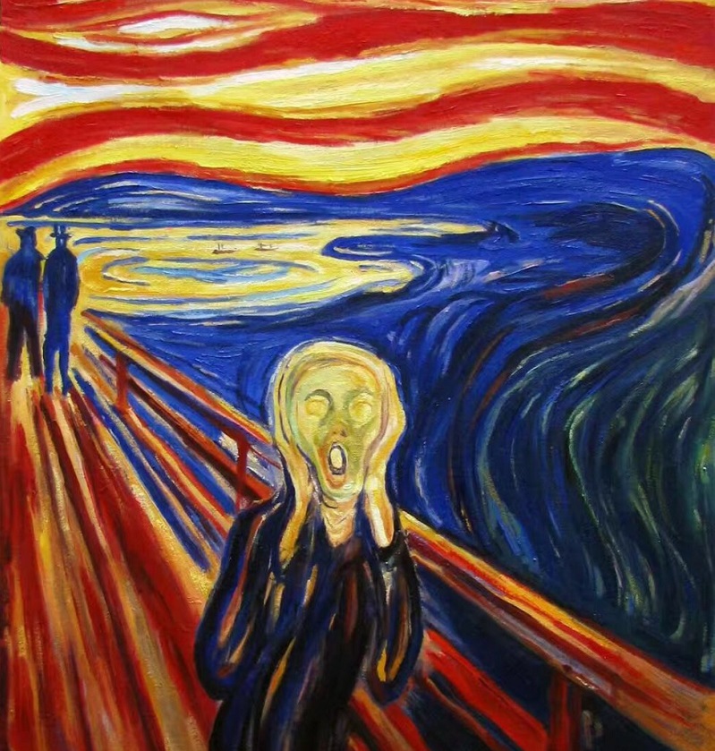
The result: part practical guide to pollution, part eyepopping art project, and also the best thing to stare at when you have cabin fever on an AQI high day (and the stale air in your closed off room leaves you lightheaded and in need of some trippy visuals). All in all, it's enough to make scream in simultaneous terror and awe, just like the fellow in Edvard Munch's most famous painting:
To give AirVisual Earth a try, click here, and be sure to let us know what you think in the comments section below.
More stories by this author here.
Email: kylemullin@truerun.com
Twitter: @MulKyle
WeChat: 13263495040
Photos: Kyle Mullin, Mike Wester, paintingmania.com


